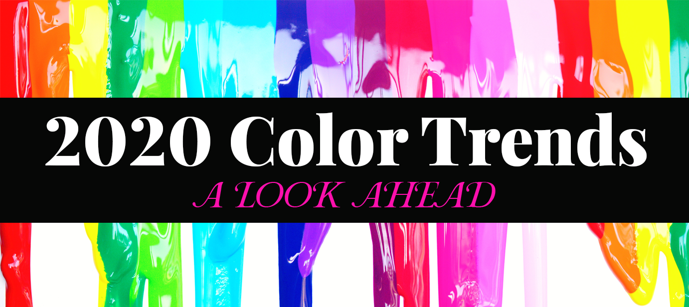
2020 Color Trends Are Here!
Every year at this time, big brands and color authorities are releasing their predictions on what colors will be trending in the new year. Think color trends don’t matter? Guess again. Whether you’re aware of it or not, you know what color trends have been in the past versus what they are today. They’re subtly on your radar and you probably don’t even realize it. You can easily spot old trends simply based on their color. Take the recently-restored Brady Bunch house. The color palette of the late 60s and early 70s is quite memorable: mossy greens, yellow ochres, rich oranges, and deep browns. We see crushed green velvet or orange shag carpet and we’re instantly transported back to that era.
SO WHY SHOULD YOU CARE ABOUT COLOR TRENDS?
Well, if you’re designing your own layouts for us to print, unless you’re going for a vintage look, you’ll want to make sure you use colors that are current so that they appeal to your target audience. Following a trend is an opportunity to experience something fresh and exciting. Variety is the spice of life. Perhaps this explains why we welcome a new color and why this generates consumer activity. So using new colors is a great way to grab your reader better and create a connection with them, making your message, whatever it may be, a home run!
Whether you’re aware of it or not, many industries are monitoring and selling color trends by way of their products. Say you’re painting a room in your house; you’ll more than likely be choosing colors that are current because they’ve been first predicted then released by big brand name company’s color experts. Or say you’re shopping for a new outfit. The fashion industry is notorious for following color trends which are easily seen in consumer products. A great example of a brand using color to excite their audience is Target. Their strong use of color throughout their stores, displays, print and digital advertising is always ahead of the curve which has created a cult-like fan base of consumers.
WHAT’S IN STORE FOR 2020?
Let’s take a look at what the leading color authority Pantone is forecasting. Pantone is a company best known for its Pantone Matching System (PMS), a proprietary color space used in a variety of industries notably graphic design, fashion design, product design and printing. Their color experts are saying that colors for Spring/Summer 2020 will “express our desire for a sense of the familiar”.
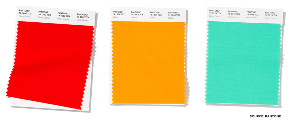
“Combining our desire for stability, creativity, and more spontaneous design approaches, the color palette for Spring/Summer 2020 infuses heritage and tradition with a colorful youthful update that creates strong multi-colored combinations as well as energizing and optimistic pairings,” said Leatrice Eiseman, Executive Director of the Pantone Color Institute. A link to the full article can be found here.
An emotional response to any color is to be expected—and anticipated. That said, it’s a designer’s job to use that as a tool to make their point by calling attention to and away from certain content in their design. For instance, a call-to-action should have a bright, attention-getting color, while more subtle colors can be used to downplay something that may not be as important. Or even something that’s required but may detract from the rest of the content, like fine print or other minutiae.
COLOR TRENDS ARE NOTHING NEW
Color forecasting has existed in some form since the early 1800s. It started off simply, with books and dissertations on the nature of certain colors and their psychological impact, and the science of color. Color forecasting has now expanded into a critical communication tool that color design professionals use to speak to the world around us.
Big brands such as Coca-Cola, UPS and Tiffany all have their own color that they’re known for. (Can you name all three?) They have created a universally-used color palette to establish and distinguish themselves from their competition. From fashion to paint and automotive to industrial design, brands large and small are monitoring current trends and looking for that next “big thing” to grab consumer’s attention.