Files, Formats + Fun!
Like our tagline says, we “Design, Print and Deliver” however sometimes, customers prefer to provide us with their own artwork. That’s why we’ve made it easy to upload files to us via our website using our Contact Us page. There, you’ll find links to upload your files in several acceptable formats: .PDF (our preferred format), .doc, .xls, .ai, .eps, .jpg or .ppt.
Each job we print is printed from a .PDF file. So if your layout or document was created and saved in a program such as Microsoft Word or PowerPoint, it needs to be saved out as a .PDF file so that it embeds all fonts and graphics. Otherwise, if we save out your document as a .PDF file, it runs the risk of the fonts or graphics not embedding properly.
BLEED VS. TRIM
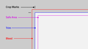
“Trim” means the edge of the page or where we’re trimming out your layout. “Bleed” means color, text or graphics that extend past the edge of the page.
When designing your layouts, remember to keep all important information, like names, addresses, phone numbers or logos at least .125” away from the edge of the page, within the safe margin (represented by the blue line) to ensure that they aren’t cut off when your document is trimmed.
Also, to prevent an unwanted white border from showing at the edge of your document, be sure to extend any background colors or design elements past the trim (edge of the page) by .125”. Doing so creates “bleed” and provides extra space to accommodate the trimming process which can vary by 1/16th of an inch. Please do not use crop marks, bleed marks or registration marks as they are not compatible with the setup of our printing equipment.
CHOOSING YOUR COLORS
Since computer monitors use a different color definition (called “RGB” which stands for Red, Green and Blue) than that used by professional printers (CMYK which stands for Cyan, Magenta, Yellow and Black), you should convert your document to use the CMYK color definition to achieve the most accurate color results. If your software allows, use “CMYK: Web Coated (SWOP) V2” to see the most accurate representation of the final printed colors.
That said, it’s not 100% accurate to choose colors based on what you’re seeing on your monitor as they will print out in a different color model. If color is critical to your project, we recommend requesting a printed sample before we run your entire print job. This allows you to see how the colors on your monitor convert to CMYK as well as how they interact with the paper stock. Certain colors are known to be printer’s “trouble makers” such as certain shades of blue. We have workarounds to ensure that certain shades of blue print the way they are expected by modifying the color “recipe” before the job is printed.
CHOOSING YOUR IMAGES
Unfortunately, there is a lot of misinformation out there about what someone can and cannot use in their project. Because the internet is a comprehensive catalog of both copyrighted and uncopyrighted works, it cannot be used reliably for images. That said, just because something can be found online doesn’t mean it’s okay to use. You’ll want to do your due diligence in researching an image and where it’s been used and where it came from before choosing to use it in your project.
COPYRIGHTED IMAGES & GRAPHICS
Certain graphics and photos found online are copyrighted by their owners. This protects them from others using their works without their permission and for profit. This includes things such as sports teams logos (i.e. Atlanta Braves, New England Patriots, Cleveland Cavaliers, etc.), major brand names (i.e. Mazda, Home Depot, Chick-Fil-A, etc.) and licensed characters (Mickey Mouse, Little Mermaid, Avengers, etc.). This also includes books, movies and other media.
It is for that reason we cannot print anything using any copyrighted images or graphics without permission of the copyright owner. Exceptions include printing a job for business using their own logo, including large corporations such as Chick-Fil-A, AT&T, Walmart, etc. If a respresentative from a large corporation has a document needing printing that includes trademarked images from that corporation, those would be acceptable uses and we would indeed print those documents.
We cannot copy, scan or enlarge pages from books. While it may seem harmless, the issue is that Blairsville Printing would be profiting off of a copyright holder’s materials without permission.
IMAGE RESOLUTION
Image resolution is very important when printing images. If the resolution is too low, the image will look blurry and pixelated. Therefore, if an image is to printed, it needs to be: 1.) Large enough in physical dimensions and in direct proportion to the size needed; and 2.) Large enough in “DPI” or, Dots Per Inch. This is another great reason that the internet cannot be a reliable source for images as what’s required for the web is much, much lower in resolution to what’s needed for printing. Web resolution is 72dpi whereas print resolution is 300dpi.
That said, when choosing images, it’s best to use one of the no cost, license-free sites for images. Those would offer images both large enough in physical dimensions but also large enough in print resolution to create a sharp, crisp photo when printed. If you need some reliable, free resources, please contact me, Beth, at Blairsville Printing. I’d be happy to point you in the right direction.
VECTOR VS. BITMAP IMAGES
What are Vector Images?
Vector images use mathematical equations to define each component of an image. This allows vector images to retain their high-quality at any size. When possible, use vector graphics created in a desktop publishing program. Vector graphics retain high image quality at any size whereas bitmap images do not retain their quality when enlarged. It is for this reason logos, icons and other graphics are generally created using a vector program such as Adobe Illustrator.
What are Raster Images?
A raster image is composed of a collection of tiny dots called pixels. When these pixels are small, and placed close together, they fool the eye into forming a single image. Raster images work well when subtle gradations of color are necessary. Because they contain a fixed number of pixels, a major disadvantage of raster images is that their quality suffers when they are enlarged or otherwise transformed. They are also large in file size.
Given that, when providing us with a logo for your project, often times we find that logos found on the internet will not work because they are too low resolution and are bitmap files. If you’re having trouble locating your company’s logo in vector format, check with your manager or corporate office to see if they can provide you with one.
CHOOSING FONTS
You may use whatever fonts you choose in your document. We just have one rule: we cannot accept any file formats for printing other than .PDF. Why? Because when a file is saved as a .PDF, it embeds the fonts so that the document will render properly when opened on any type of computer that may or may not have the fonts you’ve selected. With over 300,000 fonts out there, not everyone has the same fonts on their computer. But saving your doc as a .PDF ensures your formatting and desired look is in tact.
CONVERTING VECTORS & FONTS
When providing files for printing, it is recommended that you convert all fonts to “paths” so that the actual font is no longer needed to render the file. It is also best practice to “expand” all effects applied to graphics in your vector programs. This eliminates any issues with properly rendering and scaling a graphic when it’s printed.
IN CONCLUSION
There is an awful lot to remember when creating files for print. I’ve been designing using computers since 1988 and have a ton of experience with all kinds of files and projects. If you need assistance with the design of your project or just have a quick question, please give me, Beth, a call. I’m happy to share my decades of expertise with you!